Southern Door Community Land Trust
The Southern Door Community Land Trust or SDCLT is a nonprofit organization that is led by a board of community representatives that promotes shared equity homeownership for families, developing urban and rural agriculture projects, and ensuring that new developments remain permanently affordable for generations of low-income families.
Goal: Develop a complete redesign of the current website with an emphasis on creating a more trustworthy and professional donation system to increase contributions.
Duration
2024
Role
UX Designer UX Researcher
Members
Solo Member
Toolkit Figma Figjam Adobe Illustrator
The Problem
In college, I sought a project that combined design with community service. This led me to the Southern Door Community Land Trust, where I identified several issues, particularly with broken navigation tabs and redundant pages that caused a frustrating user experience. After discussing these problems with the Executive Director, we held a meeting to solidify that I would fix the problem of a buggy platform and focus on increasing donations.
Checkout My Prototype!
Desktop Prototype


Southern Door Community Land Trust Website
Research Goals
Before I began my research I first identified some research milestones:
Conduct extensive research on what is a community land trust
Identifying pros and cons of other community land trust
Understanding key issues within the current platform


Gathering Participant Data
Research
The first step of my research strategy was to interview the not-for-profit director to figure out what direction she wanted to take the website. From our meeting, we decided on giving the website a modern aesthetic and increasing online donations would be a primary focus. Next, I utilized Google Forms to survey some local acquaintances in the community to understand donation habits. In just three days I received over 20 submissions.
Overview
Some questions asked during this interview were:
How often do you donate?
If you rarely or don't donate online, why do you choose not to?
What would make you more likely to donate online?
When donating online what website do you feel the most comfortable using and why?
Questions
12/20 Participants were less likely to donate due to confusion on where exactly donations would be going.
8/20 felt navigating a cluttered website with several design inconsistencies created feelings of unease.
9/20 felt there was a noticeable pattern of participants wanting the donation process to feel less transactional and more personable.
Results
Donation Habits Data
Research Insights
After collecting my data, I sorted the responses into three categories: Trust, Navigation, and Bond.

From my testing pool, I discovered that my older participants had been scammed and needed reassurance of online credibility.
“I don’t donate online because I am unsure if my money will be going to the right places.”
1.Trust

There was a common theme among users who wanted their donation experience to feel more lively and less transactional.
“If donating was more personable, I would be more inclined to do it.”
2.Bond
For a majority of my users, at some point they struggled accessing certain tabs due to faulty links and even dropped off early.
“Sharing my information is scary and sometimes I don't trust the website.”
3.Navigation

With my insights gathered, I moved on to creating personas to further understand my average user.
Next Steps
Personas
Based on my survey, I created two personas that captured the common pain points I identified. From these personas, I gained a better understanding of the goals and issues, which I would then use as a reference for my design decisions.
Define and Ideate
Defining the Problem
After collecting and synthesizing my data I was left with two big problems to solve:
How might we earn the trust of users that their donations will be spent where they intended for them to be used?
How might we make the process of donating feel more personable and less transactional?
I first began my process with a competitive analysis to better understand how competitors tackle these same issues, what I could learn from it, and how I could improve upon it. After analyzing the competition’s strengths and weaknesses, I gained a better understanding of how these platforms tackled similar pain points.
Competitive Analysis
From my competitive analysis process amongst direct competitors and browsing indirect competitor’s websites such as GoFundMe and Charity Water, I was able to think of possible solutions such as:
Adding an accessibility-friendly pop-up that will appear at the end of the homepage to encourage users to sign up for the newsletter to address transparency and being personable critiques
Giving the user transparent control over their donations by choosing where exactly they would like to send their funds
Brainstorming Solutions
From my competitive analysis process amongst direct competitors and browsing indirect competitor’s websites such as GoFundMe and Charity Water, I was able to think of possible solutions such as:
Adding an accessibility-friendly pop-up that will appear at the end of the homepage to encourage users to sign up for the newsletter to address transparency and being personable critiques
Giving the user transparent control over their donations by choosing where exactly they would like to send their funds
Prioritization
Prototype and Test
Information Architecture
My sitemap process was straight to the point. I kept the same navigation buttons but decided to swap out Upcoming Events with a Get Involved page. The reasoning behind this was due to the confusion users would experience scouring through the website looking to volunteer. Then, I decided to instead add the Upcoming Events section to the homepage to immediately grab the user’s attention.
Broken links
Important information hidden in unrelated sections
Suspicious donation link to personal paypal
Before
Added upcoming events section to homepage to give users easier access to stay up-to-date
Divided sections to clearly emphasize volunteer opportunities for onlookers
Created a donation section to give users further transparency and control over their contributions
After
Low-Fidelity Wireframes
I created a collection of low-fidelity wireframes to have a skeletal layout for my designs. My goal was to focus on functionality before incorporating visuals.
Usability Test
Before I started crafting my high-fidelity prototype, I held an unmoderated usability testing session with the organizations development associate and an unconnected third-party.
Test Objectives
How well can they traverse the website with no issues
Observe different paths users take to complete tasks
Try to complete a donation interaction
Head to our volunteer page and sign up
Visit all navigation tabs
Task
Feedback
After conducting my usability test with my two participants, I received invaluable feedback on two pages with major critiques: my donation and homepage.
Home Page
Both felt that the homepage was a bit lackluster and the associate felt that there needed to be more emphasis on the goal of receiving more donations or joining their newsletter.
“The home page is a little basic and I think we can improve upon this if we added something about being able to donate.”
Donation Page
The development associate felt that due to their target demographic being older they wouldn’t feel comfortable inputting their information and wanted that component removed.
“Unfortunately, we will need to take out the card information section because our target demographic are typically older and aren’t tech savvy.”
Priority Revisions
After receiving feedback on my wireframes, I began to focus on iterations on my homepage and donation page first.
Home Page
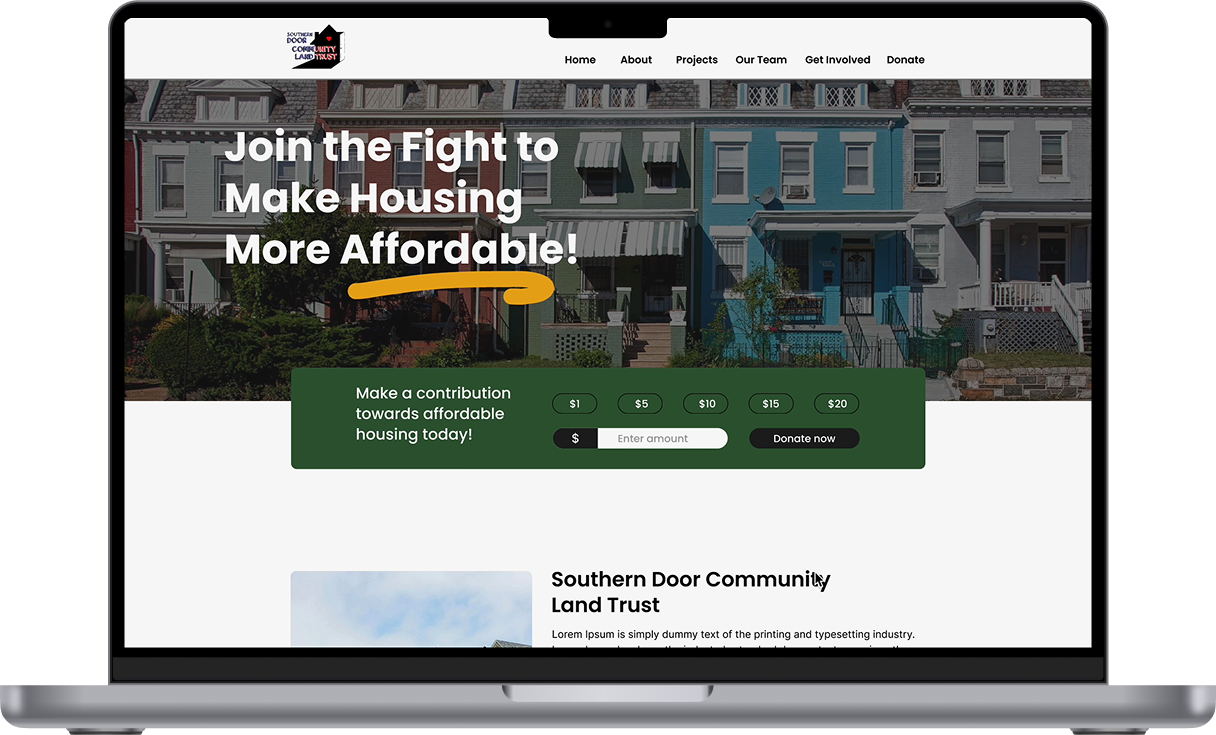
The revised prototype solves the problem of a lackluster homepage by adding elements such as an upcoming events section and a learn more tab. The donation problem is also fixed by giving users call-to-actions to donate.
Donation Page
The revised prototype solves the previous issue by sending users to the trusted platform Zeffy. I also gave users even more control over their money by allowing them to specifically choose where they would like their money to go.
High-Fidelity Wireframes
When designing my prototype, I first picked out my primary, secondary, and accent colors based on the organization’s brand identity. With the new branding defined, I built my high-fidelity prototype off of my revised wireframes. Checkout my prototype to see it in action :)!
Reflections
1. Looking back, instead of just relying on my Google survey, I should’ve also conducted a usability test to receive direct feedback on what the typical user would want fixed or maintained from the original website.
2. After completing my high-Fidelity prototype, I should’ve conducted a final usability test with animations to get final confirmation that my design is fully functional which will allow me to focus on any extreme issues.
3. Having such a big participant pool helped me gain valuable insights, but most of the participants I used weren’t familiar with the Southern Door Community Land Trust. It would’ve been better to incorporate core followers to understand what long-standing pain points they’ve dealt with.
4. I would focus on keeping on my key performance indicators by implementing Pendo.io to keep track of my drop-off rates to see how well my donation solution worked.
Lambda Zeta of Sigma Gamma Rho Sorority Inc.
Come check out some of my other work!
